In this article
- Introduction
- 1. Slow Page Speed
- 2. Poor Mobile Experience
- 3. Confusing Navigation and Cluttered Layout
- 4. Unclear Message and Weak Calls to Action
- 5. Long and Confusing Forms
- 6. Annoying Pop-ups
- 7. Poor Readability and Accessibility
- 8. Broken Links and Trust Problems
- 9. No Testing or Tracking
- Conclusion
- Frequently Asked Questions
Introduction
Your website may look great, but looks alone don’t bring sales. Many visitors are interested but still walk away without buying, calling or signing up. Often your product is not the problem. A slow, confusing, or annoying visit is a problem of design. Most of these problems are fairly easy to spot and fix. These are the most common mistakes in web design that make it harder for people to buy, along with how to fix them.
1. Slow Page Speed
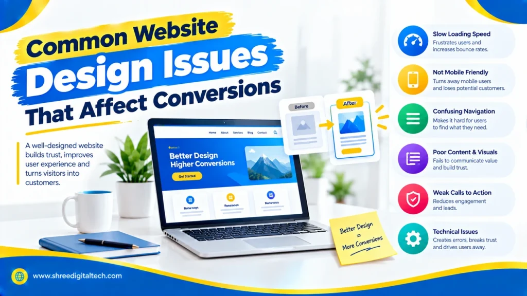
People don’t like to wait. If your page takes more than three seconds to load, many visitors will leave before they see anything. A delay of even 1 second can hurt conversions, particularly on mobile. The usual suspects are large images, heavy plugins and additional scripts.
How to fix it: Compress your images, use faster formats like WebP and enable caching. Load images when visible only, and delete tools you don’t need. Test your speed with Google PageSpeed Insights.
Also Read: 10 Important Features Every Business Website Should Have
2. Poor Mobile Experience
Phones are now responsible for most web traffic. If your site has cramped pages, tiny text or difficult-to-tap buttons, mobile visitors will quickly bounce. Google will evaluate the mobile version of your site before the desktop version for your rankings.nkings.
How to fix it: Responsive to all screen sizes. Keep text easy to read, buttons large, and leave enough space between Test your site on real phones, not just on a desktop browser that’s been resized.
3. Confusing Navigation and Cluttered Layout
If visitors don’t find what they need, they’ll go elsewhere. Too many menu items, banners and sliders make people feel lost. Your most important message is also hidden on a messy page.
How to fix it: Keep your main menu to about five to seven clean items and use simple labels like “Services” or “Contact.” Add lots of white space so that the page can breathe. On big sites, add in a search bar.
4. Unclear Message and Weak Calls to Action
Visitors make their decision in seconds if your site is right for them. If your homepage doesn’t tell them what you do and who you help, they’ll leave. If the next step is not obvious, they won’t act even if they understand. Some sites have no button at all and some have so many that none stands out.
How to fix it: Write one clear headline in plain language, followed by a short supporting line. Give each page one main call to action, such as “Get a Free Quote.” Use a colour that stands out, use action words, and place the button where people can see it easily. Test different wording and positions to see what works best.
Also Read: Business Website vs Landing Page: What’s the Main Difference?
5. Long and Confusing Forms
Many sales are lost due to forms. Too many fields, unclear error messages, forced account creation, all of these push people away. This is doubly true on mobile, where it is harder to type.
How to fix it: Only ask for the information you really need. Group related fields and show clear, helpful error messages. Allow customers to checkout as guests 2. Offer more than one payment option Small trust signals, like security badges, also help people feel safe.
6. Annoying Pop-ups
An immediate pop-up, when someone first comes to the site, can feel rude. It covers the content, and many people close the page instead of the pop-up. Google can even de-rank pages with aggressive pop-ups on mobile.
How to fix it: Display pop-ups after visitors have been on the page for a while or are about to exit the page. Keep them small. Make the close button obvious. Don’t confuse users with the same on
7. Poor Readability and Accessibility
Websites with small fonts, low colour contrast and images without alt text are hard to use. This impacts many people, including those with vision problems or other disabilities. If people are unable to read your content, they’re gone.
How to fix it: Choose clear fonts and a comfortable text size. Make sure text stands out from the background, add alt text to images, and label your form fields. Also check that your site works with a keyboard, not only a mouse.
8. Broken Links and Trust Problems
Broken links, error pages, old content, missing contact details make a business look careless. Plus, a site without HTTPS can trigger a “not secure” warning in the browser, which scares visitors away fast.
How to fix it: Regularly check your site for broken links and create a helpful 404 page that guides people back. Use an SSL certificate. Update old content. Post your address, phone number, and hours of operation clearly.
Also Read: Static vs Dynamic Website: Which One Is Right for You?
9. No Testing or Tracking
If you don’t measure what visitors do you’re guessing. Many sites never know where people leave or what page is the one that doesn’t convert.
How to fix it: Set up an analytics tool like Google Analytics and track actions such as button clicks, form submissions, and purchases. Try A/B tests on headlines, buttons, and layouts. Review your results every month and keep improving.
Conclusion
Better conversions come from fixing the little things that get in your visitors’ way. Start with speed and mobile design, then simplify your navigation, forms and buttons. Keep on testing as you go. Just fixing one or two of these can make a big difference.
Frequently Asked Questions
1. What is the main design flaw that reduces conversions?
One of the biggest is slow page speed. If a page takes too long to load, visitors leave quickly, so fixing speed is often the quickest win.
2. How many calls to action should a page contain?
One primary call to action on each page. If you add secondary buttons, make them less prominent so visitors don’t get confused.
3. Can design issues affect my Google rankings?
Yes. Bad mobile design, aggressive popups, and slow loading can hurt your rankings, and they also decrease conversions.
4. Which tools can I use to find design problems?
Google PageSpeed Insights measures speed. Google Analytics shows visitor behaviour. Hotjar and the like show where people click and scroll. WAVE can assist you in checking accessibility.
5. How often should I review my website for problems?
Check the basics, like speed and broken links, once a month. Change one thing at a time. Check your conversion data often.
Ask AI about this article
Get a quick summary or ask follow-up questions.

Akash Yadav
Part of the Shree Digital Tech team, helping businesses in the USA, UK, Canada, Australia, Europe and India grow with SEO, paid media, content and websites.